Internal Operating System
Centralizing Ministry Operations
From juggling spreadsheets to one smooth hub — a system that helps staff focus less on admin and more on impact.
Scope of Work
UX Designer
Led User Research
Design Thinking
Created Wireframes
Built Hi-fi Portfolio
Information Architect
Define sitemaps
User flows
Structured system clarity
Project Manager
Project schedules
Tracked workloads
Coordinated team communication
Developer Collaboration
Partnered with web developers to align designs with technical feasibility and ensure smooth handoff
Timeline
Oct. 2024 - Jul. 2025
Type
Internal Web Application
Tools
Figma, Google Workspace, WorkPress, Canva, Github
Project Overview
Challenges
The ministry already had pieces of a system — time trackers, reports, project files — but they didn’t fit together. Staff moved from tool to tool, hoping to piece together what they needed. Instead, information got lost, communication slowed, and work efficiency dropped. The challenges became clear:

Fragmented Workflows
Tasks are spread across disconnected platforms.

Hidden Project Files
Documents are stored in personal drives.

Communication Gaps
No central place to know who to contact.

Inefficient Reporting
Submitting and reviewing reports was inconsistent.
Goals
The project’s goal was simple: create one system where staff could do all their internal work in one place. No more jumping between tools or wasting time searching — just a single hub to make work more efficient and collaboration smoother.
Project Timeline
The scope of this project was ambitious, but our resources were small — just one designer and a small web development team. To make progress possible, we split the work into two phases.
.png)
-
Phase 1 focused on laying the foundation: designing the core system for staff and volunteers.
-
Phase 2 built on that base, expanding functionality for managers and leads, and preparing the system for implementation with developers.
Discover
Before jumping into design, we needed to uncover how work actually flowed inside the ministry — and why existing tools weren’t working. The goal was simple: understand the real challenges staff and managers faced, then ground our design decisions in those insights.
To do this, we combined multiple research approaches:
Research
User Interview
Spoke with 8 staff and volunteers across departments to learn how they tracked time, submitted reports, and managed tasks. These conversations uncovered key pain points and revealed that different roles had very different needs.
Stakeholder Interview
Spoke directly with ministry leaders to understand operations from a management perspective. Their insights highlighted gaps in oversight, reporting visibility, and communication between teams.
Competitor Analysis
Tested several project management tools in the past. High staff turnover and strict user limits made them unsustainable. Still, studying these tools was useful — they offered design cues and feature patterns that guided how we structured time tracking, reporting, and role-based access in our own system.
Result
After gathering insights from interviews and discussions, I organized the raw notes into clusters using affinity mapping. This helped surface patterns across different roles and workflows. From there, I applied thematic analysis to group the findings into three clear categories: Pain Points, Needs, and Desires.
Affinity Mapping
I first sorted interview notes into themes such as Document Management, Clock In/Out, Navigation, and Communication. This exercise made it clear where staff were struggling most.

Pain Points, Needs, and Desires
Next, I distilled the themes into structured categories.
-
Pain Points highlighted what was slowing staff down — scattered documents, unreliable clock-in/out, and unclear communication.
-
Needs reflected the essentials — a centralized system, project categories, and access to work hours.
-
Desires revealed what would make the system truly usable — a search bar, dashboards, and role-based access levels.

Define
After research, I synthesized the findings into personas and mapped the end-to-end user journey. These artifacts made the user needs and pain points tangible for the team. From there, I used the Define board to prioritize opportunities, create user stories, and set success metrics that would guide the next design phase.
Personas
To design an experience that works for everyone, I created personas representing each user level. These visuals highlight their role in the system and their level of access/responsibility, which directly shaped page flows and feature priorities.

Admin
(Level 1 User)
Oversees the platform, edits course content, and manages users.

Manager
(Level 2 User)
Guides team members, tracks progress, and manages quizzes and resources.

Staff
(Level 3 User)
Learns through courses, takes quizzes, and manages their own profile.
Journey Maps
To better understand how each persona would move through the system, I mapped out their key workflows. These journeys revealed where friction occurred and how the new system could streamline tasks.
UX Workspace: From Personas to Workflow
This workspace brings all the building blocks together — from personas and journey maps to workflows and site architecture. It’s where I translated research into structured design decisions that guided the next phase.
What's inside this workspace
-
Personas (details): Roles, levels, and responsibilities.
-
User Journey Maps: End-to-end touchpoints and pain points.
-
Affinity Map: Grouped insights from research.
-
Pain Points, Needs & Desires: Directly voiced or observed from users.
-
Sitemaps: Information architecture layout.
-
Workflows: Step-by-step process flows that shape user tasks.
How to explore
Use the FigJam toolbar to zoom and pan around the board. Click, hold, and drag your mouse around to explore more.
On mobile, tap once to focus, and pinch-to-zoom. Prefer full screen? Open in a new tab for the best reading experience.
Want to dive deeper?
Click the expand button on the top right to open the board in a new tab to zoom into each artifact and follow the decision trail.
Design
With the foundation defined, I moved into design — starting with quick sketches and gradually building toward interactive high-fidelity prototypes. At each step, I communicated with stakeholders to confirm directions and gather feedback, ensuring the designs aligned with both user needs and organizational goals.
Sketches
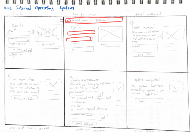
I began with hand-drawn sketches to quickly explore layout ideas for core features like clock in/out, reporting, and project management. These were shared with stakeholders early on, which helped confirm priorities and align expectations before moving into digital design.
Wireframes
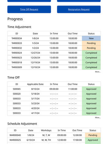
The sketches then evolved into mid-fidelity wireframes. These outlined page structure, navigation, and role-specific access, providing a clearer picture of how different users would interact with the system.
One of the key challenges of this project was designing for three distinct user roles: Admins, Project Leads, and Staff/Volunteers. While the system needed a consistent structure, each level required its own set of permissions, tools, and page layouts.
To highlight these differences, I created detailed designs that not only show side-by-side comparisons, but also explain the unique functions and access given to each role.
Deliver
Prototypes
Finally, I built high-fidelity prototypes in Figma. These interactive designs demonstrated the full user experience — from staff logging hours to admins managing reports — and became the foundation for developer handoff.
Review
What's Next
The system is designed, but the work isn’t done yet. The next steps focus on bringing the designs to life, ensuring the data behind it is solid, and preparing for real-world testing with the ministry team.
Aligning with Development
Work closely with the web developers to translate design, clarify edge cases, and set priorities for the first release.
Testing as We Build
Run lightweight tests on each feature as it’s developed. This helps catch issues early and refine flows before a full rollout.
Designing the Backend
Map out how data will be stored, organized, and accessed — from time logs and requests to project files — ensuring the system is reliable and scalable.
Internal Pilot Launch
Prepare a demo and pilot run for staff, project leads, and admins. Gather feedback on efficiency and usability to guide the next round of improvements.
Project takeway
This project was more than just a design exercise — it was a real lesson in building a product from the ground up. I wasn’t only designing interfaces, I was also structuring information, managing the process, and working side-by-side with developers to make sure the system could actually work in practice. Along the way, I unlocked new skills in UX design and gained hands-on experience in product thinking and cross-functional collaboration.
Wearing Many Hats
Taking on the roles of designer, information architect, and project manager taught me how to juggle priorities and stay organized without losing sight of user needs.
Communication Is Everything
Working with stakeholders and developers reinforced how vital clear, proactive communication is — especially in a remote and volunteer-based team.
Practical Over Perfect
Sometimes the best solution isn’t the flashiest one. Integrating tools like Google Workspace showed me how to balance ambition with feasibility to keep progress moving.
Iterate, Don’t Assume
Research expanded the project scope in unexpected ways. It reminded me that design isn’t about sticking to the first plan, but adapting as new insights surface.


