Stone Dry
Sobriety Support App
The Stone Dry application brings events and milestones together, giving users a focused, supportive space for their journey.
Skills
-
Design System
-
Journey Mapping
-
Prototyping
-
Sitemapping
-
User Research
-
UX/UI Design
Tools

Notion

Figma
About The Stone Dry Company
The Stone Dry Company is a nonprofit dedicated to supporting individuals on their sobriety journey through community—spreading the idea that sobriety is fulfilling and empowering, and offering connection, resources, and encouragement to those just starting recovery.
Project context
Built through Develop for Good, connecting volunteer designers with nonprofits to create meaningful tech solutions.
Type
Mobile App Design
Team
Design team of 8
Role
Product Designer
Information Architecture
Timeline
Oct 2024. - Feb. 2024
Challenge
Fragmented Resource Access
Without a central hub, members spent more time hunting than getting help. Resources were spread across channels, lowering engagement and interrupting momentum in sobriety.
Project Scoping
Before sketching screens, we mapped every idea on an impact–effort matrix. Seeing trade-offs side by side made the path obvious: lead with high-impact, lighter-lift features the community would feel immediately, and park heavier ideas for later. The matrix became our guardrail in reviews—keeping scope focused and decisions grounded.

Objective
With priorities clear, our aim was straightforward: increase community engagement by improving communication and centralizing tools for people seeking support in their sobriety journey—while raising awareness for events and meetings.
Key features:

Events
Finding and registering for events and meeting

Tracker
Allowing users to track their recovery milestones

Resources
Accessing resources directly within the app
Discover
To understand real challenges in the sobriety space, we spoke directly with users and Stone Dry leaders through a user survey and interviews. We also ran a competitive analysis to identify effective patterns and gaps, which informed the app’s core features and information architecture for the first release.
User Research
We surveyed 31 participants and conducted 2 interviews, then synthesized the findings with an affinity diagram to cluster recurring needs and pain points. The patterns that emerged guided feature prioritization and app structure, ensuring the design reflects a clear, comprehensive understanding of our users.

Competitor Analysis
We examined sobriety/support apps and event-management apps to understand how features are structured, what works well, what doesn’t, and where gaps exist. This review surfaced key strengths and common pain points, which directly informed our feature priorities and high-level app structure for the first release.
Define
Personas
Based on our survey, interviews, and client input, we defined two archetypes to guide decisions while protecting individual privacy. We intentionally omit personal details (e.g., age, background, needs, goals).
Branding
We began by reviewing the client’s mood boards to anchor the visual direction in Stone Dry’s mission and values. Using those references, we explored color options that balance vibrancy with professionalism, experimenting with combinations and UI accents to capture the desired emotions.


From there, we curated a cohesive color palette and paired it with complementary, readable typography to reinforce the brand’s supportive tone. The result is a consistent, credible visual foundation to guide screens, components, and states.


Blueprint of the Experience
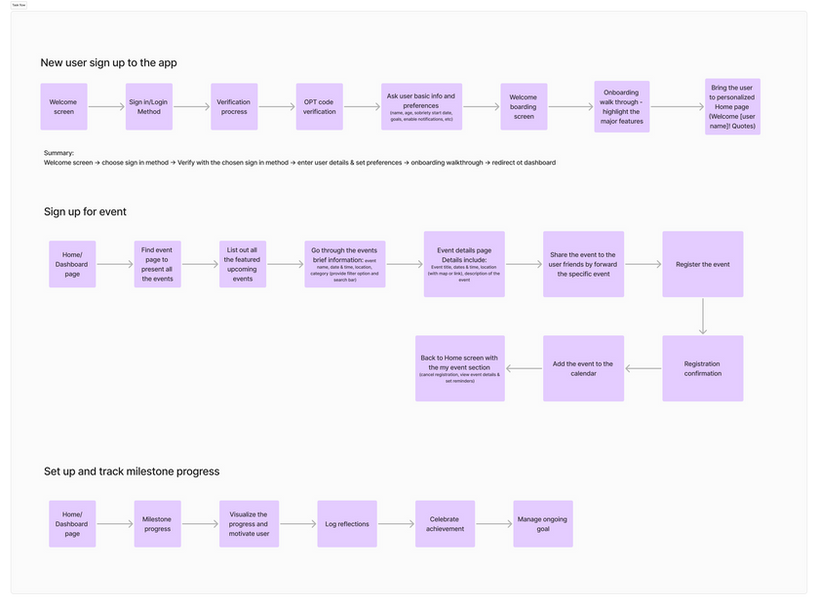
Before moving into design, I created the sitemap along with detailed user and task flows. The sitemap outlined all the pages and how they connect, while the flows mapped step-by-step actions like signing up, registering for an event, or tracking a milestone. Together, these artifacts gave the team a clear blueprint of the app’s structure and interactions—aligning everyone before diving into detailed design.
Design
Ideation -> Mid-fi
Moving into the design phase, we began with mid-fidelity wireframes to quickly shape the app’s core screens: welcome, login, home/dashboard, profile, event registration, milestone tracking, and the resource hub. To stay efficient, our team divided the work in pairs so every screen had two designers collaborating.
Focus areas: clear entry points, scannable sections, predictable navigation, and tap-friendly components.
Splash Screen

Home Screen

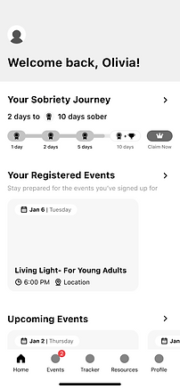
I co-designed the Home screen, which we treated as the app’s first impression. Our goal was to make it instantly clear, easy to navigate, and a true overview of what Stone Dry offers. The design highlighted core services at a glance so users would know exactly what they could do from the start. This low-fi version let us test layout, hierarchy, and key actions before refining visuals.
Iteration
After sharing the design with the nonprofit client and our internal team of seven, we refined the experience based on their feedback.


The biggest shift was a Home reorganization:
-
Before: Upcoming Events, Favorite Events, Resources
-
After: Registered Events, Upcoming Events, Your Groups, Saved & Past Events, Saved Resources, Motivation Quotes
We also added a milestone unlock pop-up to celebrate progress and keep motivation high. These updates made the app feel more personal, engaging, and aligned with what the community valued most.
Deliver
Prototype
Now it’s time to put it all together—here’s the high-fidelity prototype.
Review
What's Next
From Design to Development
With the front-end design wrapped, the work shifts from Figma into development. We handed off annotated high-fidelity screens, task flows, and a starter design system to guide the build.
Core Surfaces in Focus
Engineering will begin with the main user-facing areas: Home, Meetings & Events, Resources, Milestones, and Profile—along with key states like saved events and milestone unlocks.
Expanding the Design System
To support development, the design system will need to grow into a more complete library. This ensures consistent UI patterns across screens and smoother collaboration with engineers.
Beyond the Front-End
Back-end design needed: how data is stored, managed, and connected to support the front-end experience. Our team delivered the foundation; now it’s time to bring it to life in code.
Project takeway
Staying Focused
With a team full of ideas, it was easy to get carried away. I learned the importance of bringing our focus back to the priorities we set, so the design stayed aligned with what truly mattered for the community.
Clear Communication
Working remotely with teammates and the client taught me how critical it is to communicate clearly and often. Active check-ins and transparent notes helped prevent misunderstandings and kept the process efficient.
Balancing Creativity and Constraints
Collaboration brought in fresh perspectives and new possibilities. The challenge was learning how to balance that creativity with scope and constraints—making space for exploration while still delivering what the project needed.
Testimonials
“One of our favorite features is the milestone tracker—it’s going to be amazing for our community. You can tell they actually care about what they’re building, and they work together so well. It never felt like just another project for them—they were all in.”
“Working with Develop for Good to build the Stone Dry app was an awesome experience. Our team is so talented, super patient, and just overall great to work with. From day one, they really listened to our vision and brought it to life in ways we didn’t even think of. The communication was solid the whole way through, and their attention to detail made a huge difference.”
Shout-Out to the Team
Behind this design: eight brains, countless ideas, and just enough coffee to keep it all moving.


